Beyond the Zoo: Feedback wanted

As I’ve been mentioning, Kristen and I are working on a new website. We’ve settled on a launch date of January 1st… which puts us deep into preparations.

To be honest, today was the first time we really sat down to map out the plan for this site. Up until now it’s just been something we talked about every once in a while. Now it is really, really happening! It’s going to be fun! And it’ll probably be a great excuse for us to check out a billion new places in San Diego.

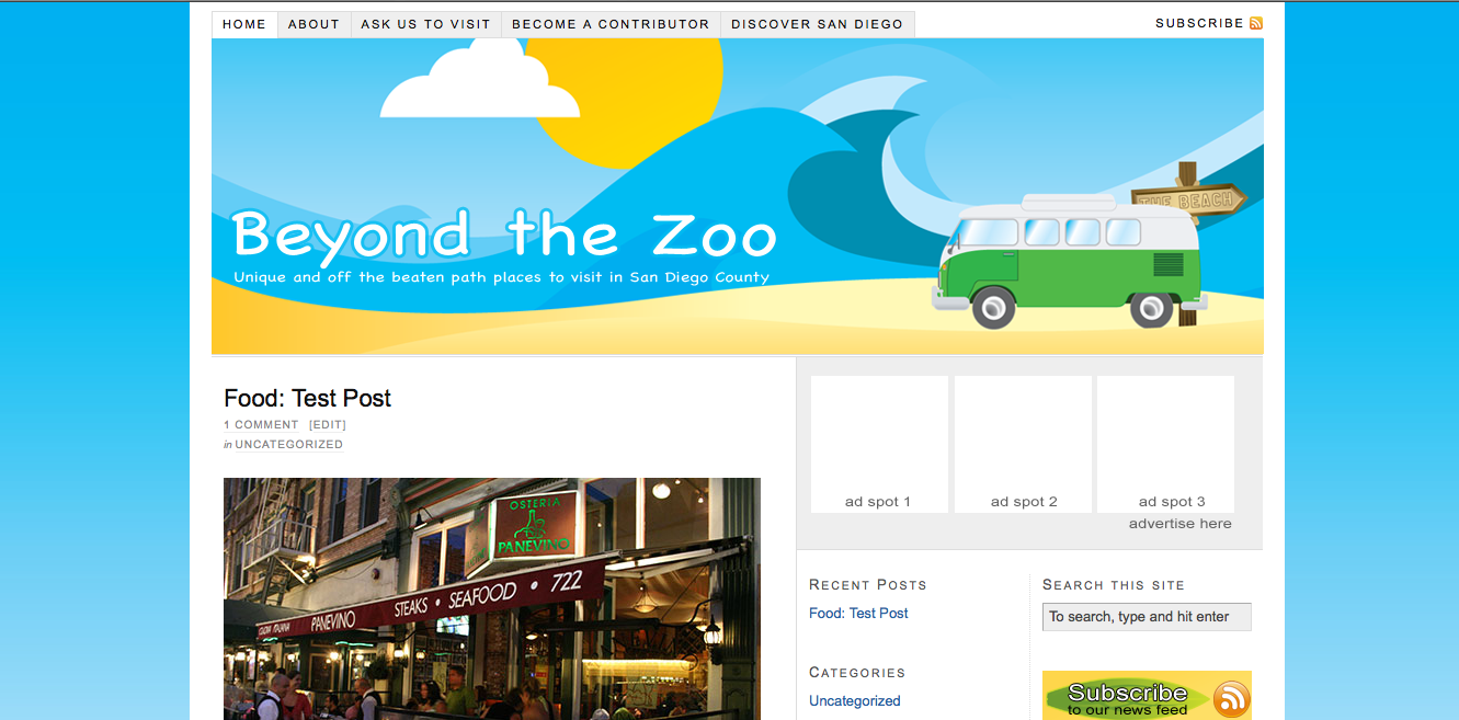
Long story short, this is the design I created based on our meeting today. I’d really like to hear some constructive criticism. How could we make it better?

Posted

in

by

Comments

5 responses to “Beyond the Zoo: Feedback wanted”

  1. Bradley Buhro Avatar

    I assume, given the fact that the screen shot doesn’t include the full front page you’re mainly asking about the banner. I like the color scheme, and the subtle gradient. I also thought it was very insightful to include the “Ask us to visit” link so prominently at the top of the screen. I assume you’ll place a similar link in the footer, as those are the two places I’d go to look for it if I were wanting to promote my attraction through your blog.

    My first reaction, however, was that I’m not feeling the font in your banner. Honestly, it has too much of a Comic Sans amateurish feel too me. I love the name of the blog itself – very creative – but not the font. Kerning feels sloppy, especially between the “B” and “e”. And while it might be necessary for legibility, I don’t initially like the stroke on the title either. (I’d want to see if I could get away without it.)

    I’d suggest heading to a good font foundry and find something fresh and creative for a title font. Veer.com has some good options. It will look more polished, and it will likely be more unique.

    The only other thing I’d suggest trying is perhaps customize “The Beach” sign with something that is distinctly San Diegan – “Mission Beach” “The Strand” “La Jolla” etc.

    I know it’s all nitpicky, but you asked. 😉

  2. adam mclane Avatar

    Bradley- That’s awesome feedback. I was really hoping for a good critique!

    I hadn’t really thought of the comic sans tie. It really isn’t but you’re right that it looks like it. I’ll look for a more unique font.

    I love your idea of putting a local beach on the sign… that’s good. It will test my illustrator skills a little bit.

    Yes, there is another link for “ask for a visit” in the footer. Right next to the advertise here one. We’re still playing with the sidebar navigation to the various topics.

    Like I said in the post, this was really the first shot at it today.

  3. adam mclane Avatar

    Here’s a different look at the header.
    http://mclanecreative.com/beachscene5.png

    I’m still thinking about changing that sign. Half of me thinks it is a good idea. The other half wonders if that would make people think that we were only going to do stuff in that specific beach community?

    Plus, would you believe that I didn’t save that illustration!!! What was I smoking?

  4. Bradley Buhro Avatar

    Yes, I personally like that much better. As for the sign, that’s a valid concern. But I like the idea of having something specifically local to tie in the banner. Maybe one of those signposts with multiple signs pointing different directions and a couple different locations.
    And yes, I can believe you didn’t save the original illustration — I do that more times than I’d care to admit. Sometimes it’s tough to remember that I didn’t save it in a format that preserved the layers but only exported it as png or jpg.

  5. adam mclane Avatar

    There is a tiny, tiny stroke on the second revision title. Just enough to help it stand out. That was helpful in the middle part against the light sky.

    Obviously, I have all the parts of the illustration to start over. Exported the png did the titles in Photoshop. (Still learning Illustrator!)

    I think you’re right. I love your sign idea– pointing to a bunch of local beaches. Kristen thinks I should pull that element altogether. I was thinking I may just swap it out for a lifeguard stand or something else like that. (Beach bum? I’d love it to have a local SD feel.) Also, I noticed I forgot to add a shadow for the van and sign… I think that would give it a bit more depth.

    Sounds like it’s back to illustrator for me!

Leave a Reply