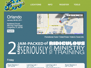
 For the last month I’ve had my head under the hood on a brand new event for YS called, “YSpalooza.”
Over at the YS blog I’ll talk a little more about what the event is and why we are excited about it.
But here I wanted to take readers behind the scenes to show off some of the nerd-factor I added to the website.
- The site is fully HTML5 compliant. (No flash or plug-ins required to view the site, it looks great on mobile phones. All the hover overs and what-not works the same on a computer which it does on a phone.)
- Since Internet Explorer isn’t HTML5 compliant, we had to learn a lot of hacks and workarounds for the world’s least functional browser.
- This is our first big event to use Eventbrite for registration. I’ve used Eventbrite for a number of things and I totally love it. I especially love how it integrates with Mailchimp.
- This is the first site in FOREVER (like maybe ever) that I build just in HTML/CSS without a content management system. It was like learning to ride a bike all over again. I love the customization level I was able to achieve by going this direction… but when it comes to managing content, there’s a reason you go with a CMS!
- Building a site in this way has an aesthetic to it all it’s own. It’s a slow and methodical method. But I have a much more intimate connection to the site than I typically would. I have spent a ton of time on each of the 50+ pages.
- Dave Luke was a freaking wizard. I’m not very good with coding websites and fortunately for me… Dave is formally trained. I broke stuff and he fixed it.
- With no SQL databases or feeds or anything like that, the site loads super fast. Really, what you see is what you get.
This was a fun project to work on. For one thing, it’s a brand new event. So we were creating a lot. Typically, I manage a group of freelancers who all do 1-2 pieces of the pie. For this one it was a blast to do it in-house, with coding help from Dave.

Leave a Reply