KidsTown Sign

So, check this out.

This is side B of our exterior sign at the church. (Other side is “big church”) This is a revision… so feel free to give me feedback on it.
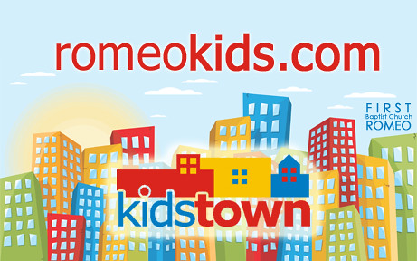
KidsTown sign, revision 2

p.s. If you haven’t checked out the KidsTown site lately, it’s got a fresh new look. www.romeokids.com
p.p.s. So does the church site, www.romeochurch.com


Posted

in

,

by

Comments

2 responses to “KidsTown Sign”

  1. Todd Porter Avatar

    I like it! You may want to try and get the “Kids Town” to stand out more, because it can get lost in the midst of the buildings. Maybe make the halo around it a little less opaque.

    But the romeokids.com stands out great!

    Do you want the churches name that hidden?

  2. adam mclane Avatar

    It’s not that we’re trying to hide the name of the church. The other side of the church is 100% dedicated to the church. We’re trying to do something different with the flip side and advertise our kids thing.

Leave a Reply