One of the crazy things about starting The Youth Cartel line of products has been, for me, learning how to make a book a book.
Prior to starting our product line I’d never made anything for print. Sure, I’d designed stuff. But it was always for the web.
Designing for print is a different beast altogether.
I quite literally bought InDesign for Dummies and read it on the trolley back and forth to my office. Bit-by-bit I figured out how to do an interior layout of a book, then a Kindle/ePub version of that.
But book covers were yet another enigma.
I didn’t know anything about covers. And that ignorance has been both a blessing and a curse in the process. (Breaking rules, not inhibited by protocols, etc.) I’ve just had to figure it out… which has been crazy fun, at times frustrating, but mostly fun.
Making Woo
My latest cover is for Morgan Schmidt’s book, Woo. (Releases March 15th)
I know Morgan a little. I know her content. I’d read the description. I poked around the manuscript.
And yet all I had was a blank template.
I tossed out a couple ideas that fell flat. I’m thankful for a team that tells me the truth, the initial ideas weren’t crappy they just weren’t right.
I chewed on it some more. I took walks to think about it. I scrolled through hundreds of book covers on Amazon seeking inspiration.
Woo.
Woo.
Woo.
Not woohoo!
How do I communicate Woo as a feeling. Woo is tough. Wow isn’t that tough. Awe, not that tough. But Woo? A tough feeling to visualize.
The subtitle gave me a lot to think about. I really like the word “awakening.” And the book is really about our innate desire to connect with God. In the pop Protestant world this awakening or celebration, worship is often manifested with images of outstretched arms to the heavens. First, that’s not really woo. Second, that’s totally played out. I don’t know exactly how that’s visualized in the Catholic sense, but as I reflected on the “woo” within that faith tradition I actually thought about the liturgy being one way God’s “woo” manifests that desire to connect. But again, that’s hard to visualize.
So… I was stuck. And the release date was getting closer and closer. Pressure is tough for creatives. We need it and it crushes us at the same time. But the pressure was on, I needed a concept to build on in a hurry.
Woo is a Shape
A few weeks back I was watching one of my favorite shows, Rick Steve’s Europe. In this particular episode he was in a city where he explored a Moorish mosque. The interior and exterior of the building was all geometric patterns. Then a few days later I watched a re-run of Anthony Bordain’s Parts Unknown episode on Spain. In it an architect was featured who fallen completely in love with the geometry of some buildings. Even Bourdain, brash and hung over, found himself drawn into the depth of the shapes.
That was the woo I was looking for.
A few days later I was getting ready for small groups… a deadline looming… a blank page staring at me like a villain.
And it hit me.
The geometry and symmetry of shapes can be one way you are woo’d by God. But also the English word itself, woo, is a shape.
I quickly wrote down the idea and sketched it out before dashing off to youth group.
It was rudimentary. But enough for me to remember.
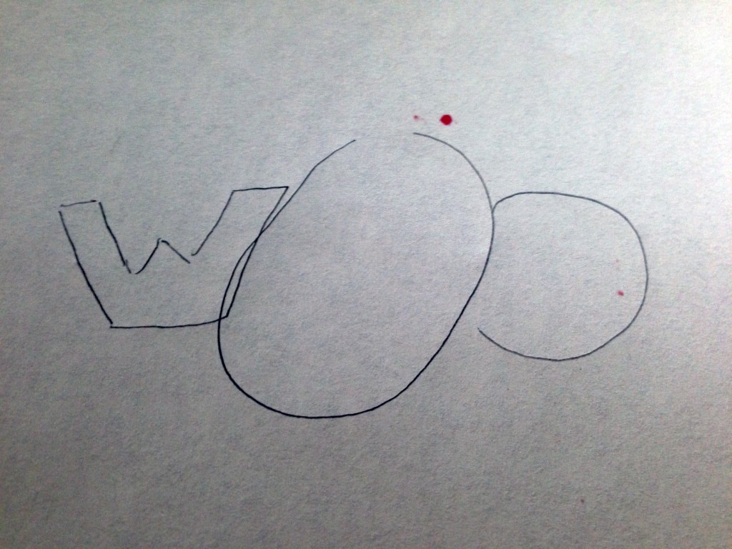
Later that night I started to envision what that might look like on a cover.
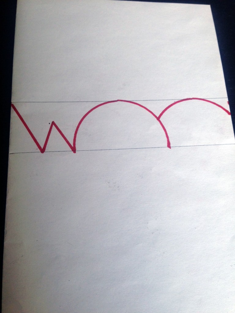
Initially, I was thinking that the shapes of the word could somehow reveal a hidden image. But the more I played with that concept the more it felt busy and hard to understand… too weird for a book cover.
I did some cutouts of the sketch above and that just lead me no where fast.
So I kept the shape idea and tried going minimalist with it. Here was my first sketch in Photoshop of the shape idea.
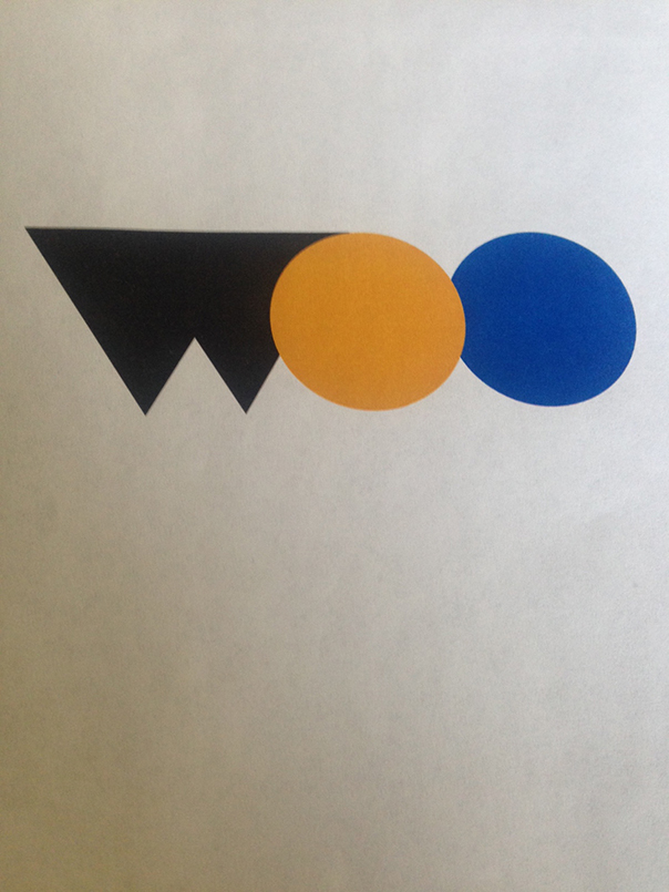
And I liked that enough to build out a full cover concept.
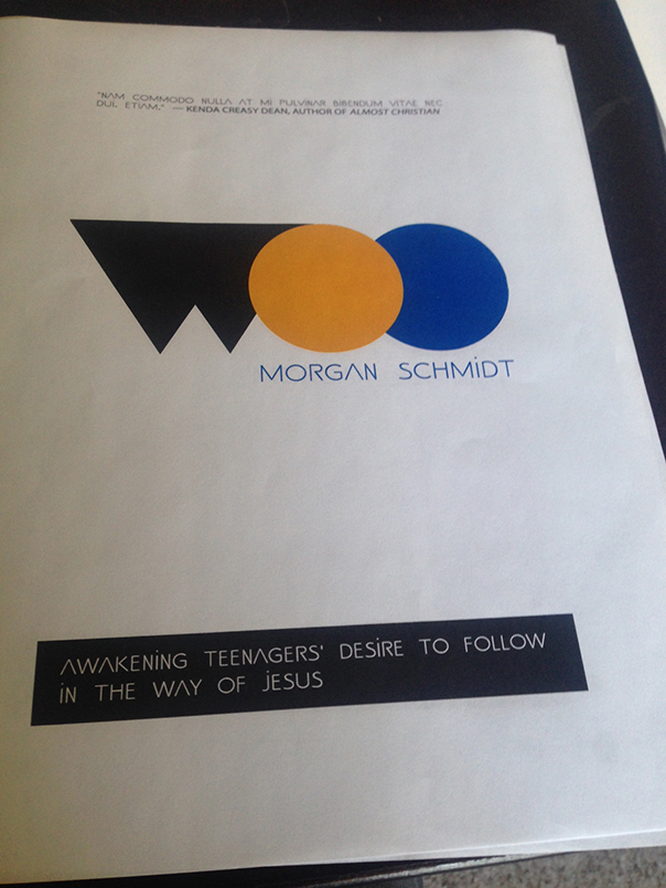
I kind of liked the simplicity of this. It didn’t feel done but I liked it enough to present to the team. It felt clean and minimalist and the shapes were fun.
But the rest of the team was on the spectrum of “meh” to “hate it.” So that kicked the concept back to the lab a bit.
At this point we looked at some completely different, non-shape, ideas. I even looked at flights to go up to Seattle to shoot some cover photography from Morgan’s neighborhood.
There’s a Shape in Woo
But the shapes were still calling me. There’s something in the complexity of the circles and triangles, something that reveals the awakening the book talks about.
So… after more time… more fiddling… more sketches in the wastebasket… too many ideas from too many people.
I decided that the complexity of the shapes wasn’t in the simplicity of it all, it could be found in depth.
So that’s how we landed here.
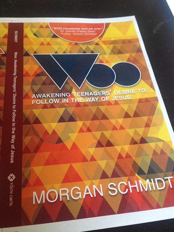
There are actually several layers, some visible and some hidden.
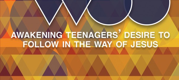
There are layers of circles. There are layers of big triangles, little triangles, and 3 layers of medium triangles set-up almost like wallpaper. To provide the depth I was looking for each of the hundreds of shapes has a different opacity. I had all of the shapes in Photoshop, in sequence by grouping, then used Random.org to pick a random integer for that layer’s shapes. So some are 8% opaque while the one next to it might be 13% or 48% or 88%.
This seeming randomness shows the complexity of God’s woo. While we are innately drawn to Him, sometimes it feels random to be drawn towards him. (And sometimes we pursue Him.) Sometimes we are drawn by human patterns. And sometimes we’re captured by seeing something familiar from a slightly new angle. But the reality is that we are merely awakened to what draws us because His appeal was there all along.

Leave a Reply