Back in January I wrote this:
The winner of the 2008 election will be the candidate who captivates the American people’s attention with ideas, uses the internet the best, and can prove that they can/will lead the American people.
As someone who sees the power of the internet on a daily basis, my opinion is that the who ever uses the internet the best will win the election. Of course, it’s a silly unproven theory… but its my blog so I can sensationalize all I want.
Quick reminder about what I wrote about endorsing a candidate. I’m not doing that, just making commentary here about the candidates websites.
So, here are my rankings of the five remaining candidates websites.

Quick preface: These are all good sites, this is just what I think is the best.
5. John McCain Let’s start off with two negatives. It has a pre-landing page, landing page. In other words, in order to get to his campaign site I have to click “enter site.” Worse than that, you have to scroll down to find that navigation. Blech. Second, maybe this is too obvious. But when you are the oldest candidate running, maybe you want a picture in color showing you as a younger guy? From there, it doesn’t get much better. The main page has about 25,000 choices to make and none really stick out to me as “this is what they want me to do.” The first time I went to this site I thought it was a fan site and not the official site of a guy running for president. I don’t like the color scheme of the site, I think it says “old guy” to me. The plus is that it’s very functional. It gets the job done, has lots of media, and proudly displays their front runner status. I’m guessing this website will get a major overhaul when he names his running mate. Compared to the rest of the group though, this site is a distant 5th place.
4. Ralph Nader. This is a glorified blog with the same annoying pre-landing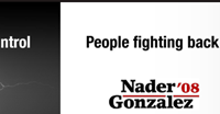 page, landing page. I love the simplicity of the site, but I looked for ways to connect and I didn’t see any non-traditional ways. In fact, it tells you how to take action (outside of the obvious ones… giving cash or volunteering) but it doesn’t really point you to exactly what to do. One place on the site it instructs you to place banners on your website, facebook, myspace, etc… but there isn’t a link to those items so I wouldn’t know how to do that.
3. Hillary Clinton. At first blush this is a very pretty website. In fact, it is a great website. When I looked at it I thought, a little too good. That is because it is nearly a carbon copy (toned down) version of Barack Obama’s website. Same color scheme & same general idea. Looking at the landing page, it’s clear what the goal is… contribute. In web design, everything is determined by the conversion. In other words, they measure success by what the site causes you to do. Looking at the upper fold (what loads on the landing page without you scrolling down) there are 3 bright red buttons that say contribute. To me, the landing page communicates two things, we need your money and the call to action of “help us gain momentum” is admitting that they don’t currently have the momentum they need to win. Deeper in the site there are some cool features. First, I love that it can be translated to Spanish. With UTF-8 encoding, that is easy and I like that she advertises such on top. Second, I like the use of big vs. small. It makes for a very appealing site. Good navigation is expected for a site of this magnitude, it’s not the best but it is obviously getting the job done. On the negative, I couldn’t find things I like to see. No easy access to site badges and this is picky, but I don’t know about basing the website around a candidates first name.
Uh oh… Adam doesn’t think a republican has the best
site. You got that right, I don’t. I love the fact that there is no pre-landing page. When I go to his website (clicked on a Google ad to get there.) I don’t have to look at a call to action to give my email address.

I like the colors that they have chosen. And I like the design features, especially a blog roll and an easy way to get blog banners and stuff like that if I wanted to tell people on my blog that I support Huckabee. The biggest miss, in my opinion, is that he doesn’t feature videos on the landing page. His ads with Chuck Norris are probably the funniest political spots I’ve ever seen… I’d put that right on the front page. Mike is also the funniest candidate of the bunch, and people like humor in politics. I wish there were something less serious on the home page. I also don’t like that it isn’t as deep of a website as the others. It is very good, just not the best.
1. Barack Obama 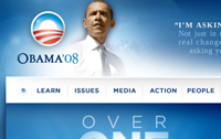 Let’s get this out of the way, I hate the pre-landing landing page. It’s a big negative for me and if it weren’t for the superiority of everything else it would have bumped this site down.
Obama has one of the best expressions of “web 2.0” for personal purposes anywhere. What I mean by that is this… you get the idea that the Obama campaign doesn’t control 100% of the Obama story on the internet. I could go and join the discussion there, register to make phone calls, blog on their sites, etc. (You can do some of this on 2 other sites as well) The home page design is excellent. It puts their man, looking presidential, right on the header. It has a great quote, reflecting on what seems to be working for his campaign best. Color scheme is great. I like the rotating main page thing going through the hot issues. While I was working on this post, it added a Spanish button just like the Clinton campaign… also a good move. What I like most about this site is that it feels like a site you could actually spend time on. The icons on the right allow you to sign in, find friends, and start helping the campaign in non-monetary ways. (In fairness, most of the sites have this feature… Obama just seems to make it most prevalent.) There is a call to give, same colors and placement as the Clinton campaign. (Tells you it must be working) I like that below the main, serious stuff, there is a less formal blog. Also, there are some great… funny… things you can do at this site. Most hilarious is Obama ringtones for your cell phone. Not only do they have Web 2.0 nailed with widgets, AIM buddy icons, etc… you can actually download ringtones of Obama saying semi-funny things. (Listen to these and then imagine any of the other 4 candidates trying to pull that off.) It’s really cool, they even have a whole text message thing.
From a search engine standpoint, all of them are doing great. More on this later.
Leave a Reply